UI Building Blocks
Pre-built components that give you consistency out of the box
TL;DR: Don't design screens from scratch. Compose them from ready-made blocks. Every list works the same. Every detail page looks the same. Consistency like Retool or Airtable.
The Idea
Traditional development: you build every screen from scratch. Button here, table there, figure out pagination, implement sorting, wire up filters...
Straktur approach: You get building blocks. Each block handles its complexity internally. You compose screens from these blocks. Result: consistent UX across your entire app.
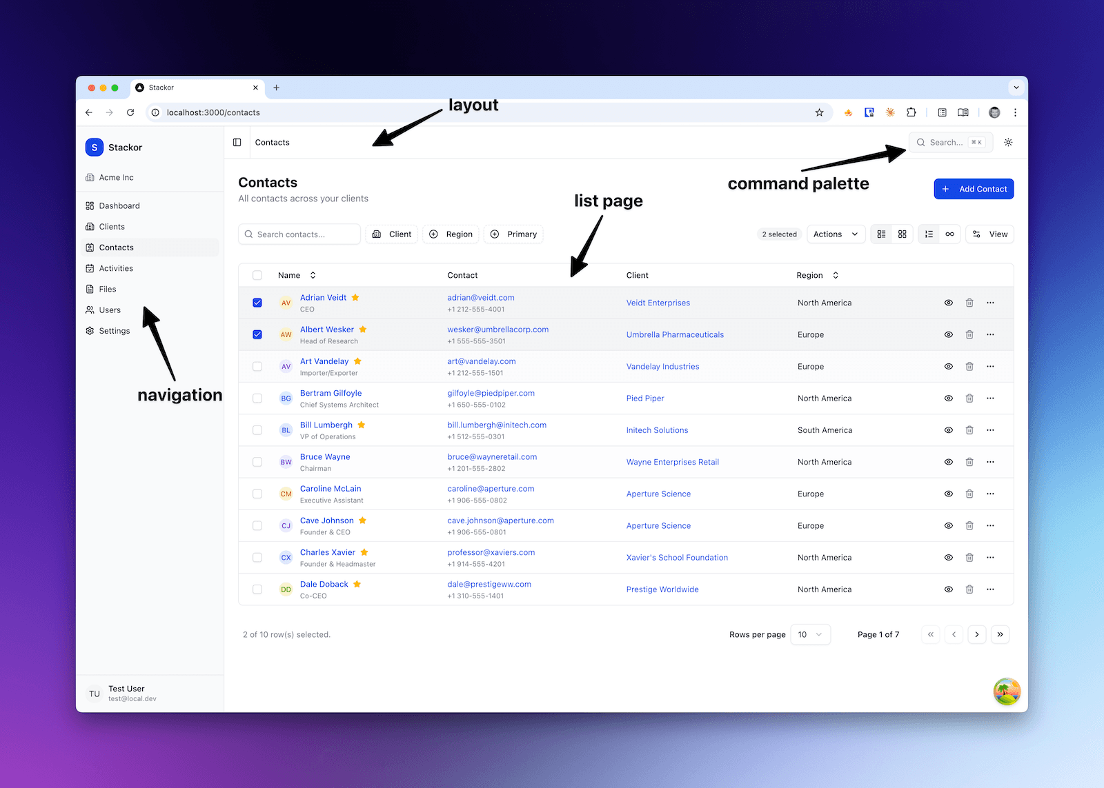
List Page (DataTable)
The workhorse of any business app. Every list in Straktur uses the same DataTable component.
What You Get Out of the Box
| Feature | Description |
|---|---|
| Column sorting | Click any header to sort. Ascending, descending, or none. |
| Column visibility | Users can show/hide columns. Settings persist. |
| Two view modes | Table view or Card view. User toggles between them. |
| Pagination | Classic pagination with configurable page size (10, 25, 50, 100). |
| Infinite scroll | Alternative to pagination. Loads more as you scroll. |
| Search | Global search across visible columns. |
| Filters | Faceted filters with badges showing active filters. |
| User preferences | All settings (sort, columns, view mode, page size) saved per user. |
| Export | Export visible/filtered data to CSV or JSON. |
| Row actions | Quick action icons + dropdown menu per row. |
| Bulk actions | Select multiple rows, apply action to all. |
What It Looks Like
┌─────────────────────────────────────────────────────────────┐
│ [Search...]  [Status ▼] [Industry ▼]    [Table│Cards] [Export] │
├─────────────────────────────────────────────────────────────┤
│ ☐ │ Name          │ Status   │ Industry │ Created  │ ••• │
│ ☐ │ Acme Inc      │ Active   │ Tech     │ Jan 15   │ ••• │
│ ☐ │ Globex Corp   │ Lead     │ Finance  │ Jan 12   │ ••• │
│ ☐ │ Initech       │ Active   │ Tech     │ Jan 10   │ ••• │
├─────────────────────────────────────────────────────────────┤
│ [Bulk actions ▼]              Page 1 of 5  [< 1 2 3 4 5 >] │
└─────────────────────────────────────────────────────────────┘
For Your Prompts
| You say... | AI knows to... |
|---|---|
| "Add invoices list page" | Use DataTable with standard features |
| "Add status filter to invoices" | Add faceted filter component |
| "Enable card view for invoices" | Configure view toggle |
| "Add bulk delete for invoices" | Implement bulk action handler |
Detail Page
When user clicks a row, they see the detail page. Consistent layout: header with key info, sections with grouped data.
What You Get Out of the Box
| Feature | Description |
|---|---|
| Entity header | Avatar/logo, title, subtitle, status badge, quick actions. |
| Section cards | Grouped information in collapsible cards. |
| Property rows | Label-value pairs with consistent formatting. |
| Property grid | 2-3 column layout for dense information. |
| Related lists | Embedded DataTables for related records (contacts, activities). |
| Tabs | Organize sections into tabs for complex entities. |
What It Looks Like
┌─────────────────────────────────────────────────────────────┐
│ [←]  [Logo] Acme Inc                    [Edit] [Delete] [•••] │
│       Technology · Active · San Francisco                    │
├─────────────────────────────────────────────────────────────┤
│ ┌─ Company Details ──────────────────────────────────────┐  │
│ │ Industry      Technology     │  Website    acme.com    │  │
│ │ Employees     150            │  Revenue    $5M         │  │
│ └────────────────────────────────────────────────────────┘  │
│                                                              │
│ ┌─ Contacts (3) ─────────────────────────────────────────┐  │
│ │ John Smith    CEO           [email protected]    [Edit]    │  │
│ │ Jane Doe      CTO           [email protected]    [Edit]    │  │
│ └────────────────────────────────────────────────────────┘  │
└─────────────────────────────────────────────────────────────┘
Detail Sheet (Side Panel)
For quick edits without leaving the current page. Opens as a slide-over panel.
What You Get Out of the Box
| Feature | Description |
|---|---|
| Form with validation | Zod schemas, error messages, field-level validation. |
| Dirty tracking | Warns before closing if there are unsaved changes. |
| Auto-save indicator | Shows when changes are being saved. |
| Responsive width | Adjusts to content, max-width on large screens. |
| Keyboard shortcuts | Escape to close, Cmd+S to save. |
What It Looks Like
                                    ┌─────────────────────────┐
                                    │ Edit Client        [×]  │
                                    ├─────────────────────────┤
                                    │ Name                    │
                                    │ [Acme Inc           ]   │
                                    │                         │
                                    │ Industry                │
                                    │ [Technology        ▼]   │
                                    │                         │
                                    │ Status                  │
                                    │ [Active            ▼]   │
                                    │                         │
                                    │ Website                 │
                                    │ [https://acme.com   ]   │
                                    ├─────────────────────────┤
                                    │ [Cancel]    [Save]      │
                                    └─────────────────────────┘
Inline Edit
Edit values directly on the detail page without opening a form.
What You Get Out of the Box
| Feature | Description |
|---|---|
| Click to edit | Click any value to turn it into an input. |
| Auto-save | Changes save automatically on blur. |
| Escape to cancel | Press Escape to revert changes. |
| Loading state | Shows spinner while saving. |
| Error handling | Shows error message if save fails. |
Available editors: Text, Textarea, Number, Select, Date, Checkbox.
Navigation & Layout
The shell that wraps your entire app.
What You Get Out of the Box
| Feature | Description |
|---|---|
| Collapsible sidebar | Main navigation, collapses to icons on small screens. |
| Organization switcher | Switch between organizations (if user belongs to multiple). |
| User menu | Profile, settings, logout. |
| Breadcrumbs | Auto-generated from route structure. |
| Command palette | ⌘K to search anything - pages, records, actions. |
| Theme toggle | Light/dark mode. |
What This Means for Your Prompts
When you tell AI to "add invoices feature", it knows to:
- List page → DataTable with all standard features
- Detail page → EntityHeader + SectionCards
- Edit flow → DetailSheet with form
- Navigation → Add to sidebar
You don't specify "add pagination" or "add sorting" - it's included. You focus on what data and what fields, not how the UI works.
"Add invoices feature with fields: number, amount, due_date, status, client relation.
List page should filter by status. Detail page shows invoice items as related list."
AI generates consistent UI using these building blocks.
Related
- Add New Feature - Step-by-step guide
- UI Components (coming soon) - Detailed component reference